Patient #3
|
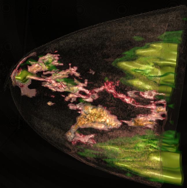
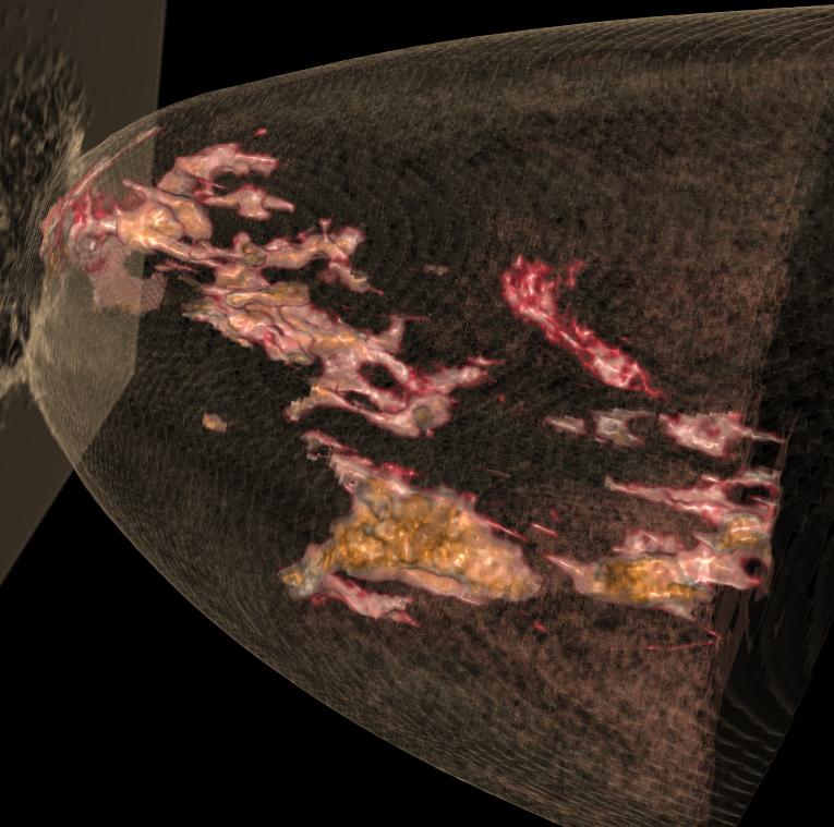
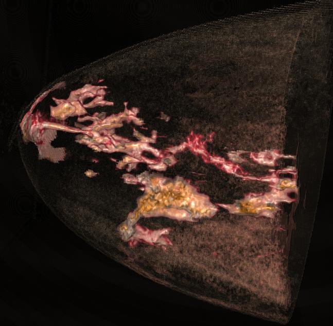
The CT dataset of patient 3 has the same problem as patient 2, the data is noisy. So we define the region which should be considered during rendering according to the PET dataset, the result will be much better. The left picture is the result image of patient #3. |
Context Image:
_signed.jpg)
|
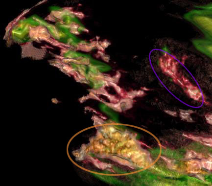
In the following picture, the white rectangles show the corresponding parts in traditional 2D slice and 3D volume. Therefore, we know which part is important. In the left and right images, same tissues are circled with same color ellipse. |
|
Detail Analysis:
Step#1
|
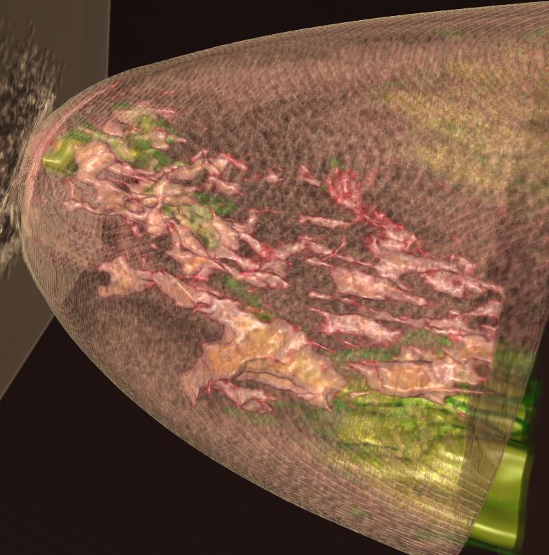
In the right image, the CT dataset is visualized in normal way combined with PET dataset. The result is not ideal, so we will deal with it in the same way as we did with the previous datasets: remove the redundant part occlude the meaningful part. |
 |
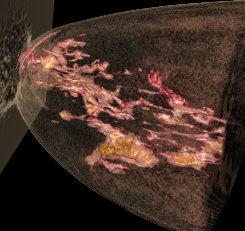
Step#2Now we manipulate the PET dataset to define the region of interest (ROI). The area with high rate of metabolic activity is where we would like it to be visible. In PET dataset, that means high intensity. We apply different transfer functions to ROI and rest region. In this case, because there are many noisy materials surround the ROI, we just set the rest area to be transparent. |
The following is an interactive demonstration of the effects of using a PET threshold to guide the rendering of the CT image. Only the regions where the PET signal is larger than this threshold are visible.
|
Step#3Reduce the ROI, the tissues which are not included by the highest rate of metabolic activity is waived. Then we get the final context image which displays the tumors doctor pointed out in the traditional 2D image with as less noise as possible. |
||
|
|
|
Compare:

|
|

|
Previous Main Next